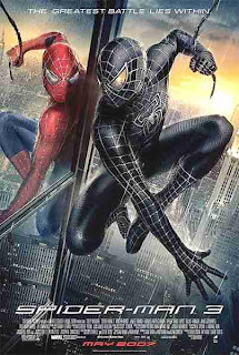
The main thing i like about this poster is how dominating the image is compared to the title. The designer of the advertisement is pretty much saying "this is the film, you know what it is because its the third in the series and its so popular" therefore the title does not need to be as big in comparison. I think this is very effective in an advertisement as the point of it is to attract the consumer.
I really like how on this poster there is a slogan or a catch phrase which applies not only to spiderman a great hero but every person, consumer or otherwise. I like the choice of image because i think it makes the poster give the audience the idea of "oh god whats going on? why are there two?" I also like how from this, you get a sense of good and evil by showing the normal spiderman in red and blue (colour) and a black and white copy.

No comments:
Post a Comment