Monday 6 December 2010

Ancillary - Poster - Gorilla Photos

Shown here are some examples or test subjects for the poster section of my project, granted half of the poses are not useable as my actor can be hard to control, though if he wasnt i would struggle to get a confident actor who wouldnt care about shaming himself dressed as a gorilla. Pictures marked X are rejected as potential poster material to be used in my final image as I started by eliminating those i did not like for reasons such as lack of lighting.


X
This picture/pose is more of a test subject then a potential poster


X
In this photo my model is posing as though holding onto the side off a building (building to be digitally inserted).
I rahter dislike the way the head piece has turned

In this photo my model is posing as though holding onto the side off a building (the building to be digitally inserted)


In this image, my actor is posing as though dominated by rage. i may or may not use this image, i am still undecided as to wether or not i think it has potential to be a movie poster. The hands of the suit are seperate to the jumpsuit that make the body and this means there is a slight lack of fur on the wrists. this could be editted in but my but too much work.


X
Here my gorilla model is freestyling some poses. i wont use this image as the pose looks too much like someones facebook display picture.


Here, my model threw his head back to make gorilla noises, the steriotypical way, in order to get into character, but unfortunately his colar became visible under the mask. this may become an annoying problem with the suit. i may have to purcahse a new mask.


X
This is a photo from the same series as the previous photo, but looks a bit like he is imitating a chicken rather then a gorilla.


X
In photos like this one where Medway chose his own poses, he unknowingly sticks his arm off the edge of the green screen. This however is not a problem as the white background is just as easy to remove via photoshop as the greenscreen. it does however pose a potential problem when filming for my trailer. It show that i have limited space in which to act in.
The pose however does look like a facebook display picture


X


X
In this photo, after a little bit of jumping around, the actor is looking directly at the camera  but the head is not on straight and you can see Medway's shirt colar, deeming this photo not worthy.


Here my actor decided to try another pose which for some reason gave an odd effect (most likely due to the lighting) on the glove whihc i have not been able to replicate.


This photo shows the actor in a better gorilla pose, on all fours. I was too close to the actor when taking the photo and the use of the flash lit up the suit far to much ( maybe due to the material the suit is made of).


This photo is the exact same pose as the previous pose but from a different angle. the same lighting problems occur again.


Fresco


Special thanks to Michael Medway - my Gorilla Model.

Tuesday 23 November 2010

Trailer Update

To make the trailer i have been using the program AFTER EFFECTS. Unfortuantely i missed the tutorial Mr. Dowson gave us at the beginning of the course. So  with tips i am teaching myself..... slowly.....

Tuesday 2 November 2010

Costume

I have a video which i am hoping to upload to this post of my actor Michael Medway, dressed in the gorilla suit.  unfortunately i am having problems uploading any videos to the blog., to overcome this problem i will upload any videos to youtube and link the videos to the neccesary posts.

http://www.youtube.com/watch?v=g9ssWKPfsaw

Propps

I dont want to many props envolved as they may take focus off of my main character - the gorilla. On the other hand this could be a good thing as my gorilla is a guy in a suit and could distract the audience from any faults - not that im expecting there to be any.

Thursday 7 October 2010

Treatment Sheet

These following are descriptions of shots with descriptions of the accompanying sounds (no particular order).
Shot 1
Visual
  • Panning
  • Lab with gorilla enclosure
Possible locations

  • Victoria College for the lab
  • Pier road chemical pharmacy for an establishing shot?
  • Gorilla enclosure at Jersey zoo
Sound
  • Soundtack
Shot 2
Visual
  • Medium shot of extra large gorilla walking through town (buildings in front and behind it)
Possible locations
  • Fort regent
  • Hotel de France
  • Mount Bingham
  • Pier Road


Sound
  • Thudding of footfall
  • Soundtrack

Shot 3
Visual
  • Midshot of newsreader at desk
  • Headlines scrolling past bottom of the screen
Possible Locations
  • Green screen
  • ITV news room

Sound
  • Cut in soundtrack
  • Stereotypical “breaking news” track.

Possible Locations
  • Car park
  • Avenue
Shot 4
Visual
  • Plane Flying in
  • High shot of st.helier

Possible Locations
  •  St. Helier
Sound
  • Plane engine
  • missiles firing 

Shot 5
Visual

  • Foot stamping on a car
  • Crushing of car


Shot 6
Visual

Possible Locations

Sound

Friday 1 October 2010

Questionnaire

Im' going to make / in the process of making a survey to gather some consumer feedback.

Wednesday 29 September 2010

In Bruges

This is a film poster for the British film - In Bruges.


In Bruges is a comedy/thriller, straight away it is easy to see which genre the film belongs to, this is due to the images on the poster. The main image is the main character within the film, Colin Farrel, he looks serious towards the camera. The seriousness of the characters facial expressions connotates that the film will be quite serious, this coincides with the fact that he is holding a gun in his hand. However, in the characters other hand he is holding an ice cream, obviously this is done in humour. The seriousness of the gun contrasts with the fact that he is holding an ice cream in the other hand. The image of the swan next to another man also holding a gun has the same effect to, these all show that the film is of a comedy genre.

The title of the film is in a bold font and is written in a bold pink colour, the title stands out to the audience. It is positioned at the bottom of the poster but it is in a large enough font so that the reader spots it easily, a reason why they may have decided to position the title at the bottom could have been so that, the scenery shown in the image makes the audience wonder where it is and then when they see the title they will know afterwards. This engages the audience with the poster.

Lighter colours are used in the background at the top and the bottom of the page, these then blend into a darker colour at the middle of the page, this may have connotations towards where the characters areplaced within the poster.

Tuesday 28 September 2010

Ice Age 3-D

American Beauty

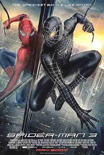
Spiderman 3

The main thing i like about this poster is how dominating the image is compared to the title. The designer of the advertisement is pretty much saying "this is the film, you know what it is because its the third in the series and its so popular" therefore the title does not need to be as big in comparison. I think this is very effective in an advertisement as the point of it is to attract the consumer.
I really like how on this poster there is a slogan or a catch phrase which applies not only to spiderman a great hero but every person, consumer or otherwise. I like the choice of image because i think it makes the poster give the audience the idea of "oh god whats going on? why are there two?"  I also like how from this, you get a sense of good and evil by showing the normal spiderman in red and blue (colour) and a black and white copy.

300


These two posters are adverts for teh same film, 300. The first thing that caught my eye on these posters were the bold, block colour that are used to form the title. I really think it suits this particular poster to have bold colours on the tile yet not on the image because it adds to the nature of the film towards the historical fact of it being set in dark times. I think the use of clashing colours on a movie poster can be good because it makes important things like the words stand out boldly so you can read them from a distance.


The posters includes the most basic of information which is good for a teaser poster and also attracts the audience attention by the solider battling the weather (in the case of the poster above) and the oddly positioned women (in the case of the poster below). From these posters i have analysed so far i think having some kind of design/plan forming for my poster. It needs to be perfectly ledgible yet new, interesting and out of the ordinary; whereas a big block of writing would not make a person want to look at it as it would come across as just another film  


Monday 27 September 2010

War of the worlds

This poster, released to promote the film War of the worlds is a very simple design. All obejcts such as text and images are centred. The very top most item is the starring actors name, Tom Cruise. This stands out and does so in order to advertise one of the more successful selling points, a popular actor. Even if the potential consumer does not like this particular genre of movie, which can be depicted as sci-fi, as deducted from the given images and title, then the consumer may view the movie just to see the advertised actor. The black back-ground ensures that the image chosen stands out with the title. The image could be considered quite shocking as it is an alien hand holding the earth, our planet, a symbol of humanity, in its clutches. This, along with the firey glow effect, gives the impression of humanitys impending doom. The title has been split into two parts, "WAR" and "OF THE WORLDS". The word WAR looms over the planet earth, sneaking up from behind, most likely meaning that in the film humanity does not know war is upon them until the last minute.
In the middle of the listed major members involved in the production and distribution of the film is the date of relase, JUNE 29. All text is in block caoitals allowing it to stand out, but in order for more vital text to stand out from the rest the font has been changed along with the text colouring to white which a gray overcasting shadow so not to leave a block solid colour. The film title has been given a 3D effect to make it appear as to be part of the image, all in all proving very effective.

Fast and Furious


This is the movie poster for the forth film in the series of the fast and furious series, Fast and Furious. This poster relies heavily on the success of the previous films and how recognisable the actors within are. The faces shown are in black and white and are the four most successfull actors/actresses within the film.The choice of order is to place the most succesfull person at the front, however the front-most actress is also there for the sex-appeal. The dominating image on the poster is of an impressive high performance American muscle car. this was achieved by makinng all other images black and white and leaving the car in colour.

Cloverfield

This is the movie poster for cloverfield released for advertisement  purposes. It's simplicity in design does not rely on famous names to sell, but the contents of the films events. an example of this is the background image, depicting the destruction of a historic american figure or iconic building/city which could be considered the secondary capital of america. This film should have a large veiwing audience for this reason. Those from america would veiw the film in order to find out what could destroy this scene and hope for a happy ending for their nation. whereas the rest of the world may view the film to enjoy watching the americans lose (playing on the side that america is hated). The only other items on the poster are the film title "CLOVERFIELD" which is following the example of all other film posters by having all text in block capitals, and the date of release. This is the simplest film poster i have seen and judging from the success of teh film i will aim poster poster to be less like this one.

Harold & Kumar, Escape from Guantanamo Bay


This is the movie advertising poster for Harold & Kumar, Escape from Guantanamo Bay. The image, although in the background, dominates the majority of the consumers attention. It is a very colourful image, directing any assumptions of the film towards a happier genre such as comedy. The two characters shown are the main characters within the film and dominate the majority of the screen time. Every part of the image is a sense of lack of freedom, such as the bright orange criminal jumpsuits, the wire fence and the guards tower in the distance between Harold and Kumar. This poster partially relies upon the consumer having seen the previous film in order to understand fully the story of the film other then escaping from a detention centre all-be-it, the most heavily protected protection centre in america. The title "ESCAPE FROPM GUANTANAMO BAY" is very small compared to the names of the characters "HAROLD & KUMAR." This is showing that the film is a about foreign characters in living in america. The comical distress on the faces draws in the consumer and then tells the consumer what the film is called as the consumer must be closer to read the title when compared to other film posters. 

The Matrix

I really like this poster because i think the colour scheme works really with with expressing the technological nature of the matrix's dark hearted theme as the colours are cold and the heroic action poses remind you of the all the superhero stories you love as a child, giving the poster a very action-packed theme, without the need for explosions.


I think having a picture of the characters/actors is a good idea because it lets the audience see who they will be watching should they choose to view the film. It will help some people put the actors names to the face of the film; eg. "oh have you seen the new Keanu Reeves film?"
My one criticism would be that the title is too small and should span from the left of the poster border to the right. This would enable the poster to be read at a distance.

Sunday 26 September 2010

Empire Film Magazine

I have chosen to analyse some front covers from film magazines as this will help me when it comes to me creating my magazine cover. I will be able to identify the key qualities used within the indusrty and therefore i should be able to effectively produce a succesful front cover myself. I decided to look at different magazines which are both avaliable to purchase in Britain, this allows me to see which attributes need to be included in the designing of the front cover and also the qualities that are present already for the target audience that I will be targetting to.

This is a front cover that was used by Empire magazine, they are a well known company within the industry and this means that they would be a good model to use when learning what I need to include when i'm creating my film magazine front cover.
A masthead used for the companies name, this allows the audience/consumers to easily identify the magazine and therefore this will help increase sales and followers for the product.


The main image is of the actor Daniel Craig, this is because the magazine offers an in depth look into the 'new bond film' a topic that will have been popular at the time that the magazine was published. Offering the audience stories and interviews that another magazine does not means that the company will then have a unique selling point and an increase in demand potentially.
When I am creating my film front cover I am going to ensure that i try and include a story or interview that would be unique for the audience and offer them something that is worth purchasing the magazine for, a technique which is used a lot within the industry.


Smaller headings are posistioned on the side of the page and are there to tell the audience what is included within the magazine, using this technique will allow the consumers to identify whether or not the magazine appeals to them.

Wednesday 8 September 2010

Saw VI

http://www.youtube.com/watch?v=FdRsM6MZOcQ&feature=channel

Saw is an ongoing film series, the first released in 2004, with a sequel beign release every year up until today with the final planned for release in 2011. The trailer was released following the example of many others, many months before the release of the film at the cinema, so that marketing had time to take its full effect. Following the example of all other official trailers (e.g. my other trailer analays's) and the legal requirements, the trailer opens with the message "THE FOLLOWING PREVIEW HAS BEEN APPROVED FOR ALL AUDIENCES" and who it has been approved by.


The music/sound effects combined with the rapid editting in the opening shot give a glitchy feel that something is wrong with the clip, a sense of unease. The shot contains a tracking shot of a persons back, with out showing the persons face, surrounding the clip in mystery. The shot then cuts to a black screen with a bright light aimed at the camera, very similar to an interigation in from the point of view of the suspect. Dubbed over the scene is a feint sandy voice saying "You think it is the living that will have ultimate judgement over you,". This is a very ominous and creepy line with many implications such as the dead will have judgement instead.

Following is a collection of illaudible seens of screaming and havoc, ending in the revealing of a previously thought dead character, dubbed with his voice saying " I am still among you. This is the provocation for the known theme to cut in which is a dark and simple yet fast pace piece of music.
The genre is clearly set as horror via the lack of lighting, tempo and nature of music and the chosen selection of actors. The selection of colours in the scenes are reds and blacks with a lack of natural light. 


Tuesday 7 September 2010

Inglorious Basterds

http://www.youtube.com/watch?v=5sQhTVz5IjQ

Inglorious Basterds is a film released in August 2009, which is a remake of the origional, previously released on a date unknown to me. The trailer was released as usual, many months before the release of the film at the cinema, so that marketing had time to take its full effect. Following the example of all other official traialers and the legal requirements, the traielr opens with the message "THE FOLLOWING PREVIEW HAS BEEN APPROVED FOR ALL AUDIENCES" and who it has been approved by. This is then followed ty a standard cut to a black screen, followed by another standard cut to the logo and company name "the weinstein company" who was involved in the distributrion and advertising of the trailer/film. This is tehn followed by the universal logo. The first advertising scene taken from the film is shown with 1 short sentence (or half a longer sentence) per cut in order to give the film a more action-packed, quickpace feel about it. This would be relatively easy to replicate when filming my trialer and seems to be very affective at appelaing the attention of the audinece. the attention of the audience is "grabbed" by a comanding officer shouting" eyes forward." this is also an effective piece of screenplay as the consumer believes the character to be talking directly to him/her. the shot then cuts to a white background containing a blood spatter across the centre of the shot. words written in this splatter draws the consumers eyeline in order to understand better the setting of the film and discover what awesome film this could be ( waiting for the film title ). the first blood spatter contains the steriotypcial childhood storybook opening "once upon a time". the opinion of the film then appears to be a "nice film" which is quickly shot down by the next blood spatter cut to reveal the words "in nazi-occupied france", which implies war and horrific scenes. the upcoming part of the trailer is a continuation of short sentences and blood spatters at quick pace. this should be simple to replicate and i may attempt this as a part of my research into ideas for my trailer. the accompanying music is a series of bass picking and drumming, altogether highlighting the film to be actionpacked carnage of guns, blood and fight scenes. at the end of the trailer, once the audience is captivated, the title is revealed "inglorious basterds" which is quickly followed by hitler, a historic figure, having a tantrum, again giving the audience a better reason to see the full length feature. the final thing to be shown to the consumer within the trailer is the date of release. saving this till last almost builds up the suspension for the consumer by making the wait to see what the film is and when it is out. this is more effective as if the title was shown first and then sees the entising clips the consumer may have forgotten what the title was or not have been paying attention.

Saturday 4 September 2010

Inception

The opening credits of the trialer is the WarnerBrothers logo depicted as an overhead view of a city, confined by the outer rim of the logo; perhaps suggesting the city within the confines of the human mind.

This spinning top on a water-stained surface, marks the first of many times that water appears in the trailer. This could be considered significant as the film's site is a replica of this shot, but could just be a red herring.

An overhead shot of the city possibly just an establishing or point-of-view shot, but important because only one building has a readable sign here, that being "MITSUI GARDEN HOTEL" on the upper left. This could be the hotel hallway that is later seen within the trailer.

This shot of Leonardo Dicaprio looking through a rainstreaked window shows leo looking on with apprehension at something going on outside his vehicle. There is at least one other person there with him, and an "EXIT" sign is visible in the background. And look there's the water again. My guess is that this shot is connected to the next shot due to its sense of continuity.

Point-of-view shot through rainstreaked window, possibly the view is of a helipad with two men dragging a man away from what seems to be a helicopter window. Upon close inspection, he has a bloody lower lip. Perhaps a fight breaks out just before? Maybe he's pursuing Leo, if the previous shot is connected, thereby explaining Leo's apprehension.

A glass of water on a wooden table significant, if only for the fact that the table and glass stay completely still, yet the water inside is tilting to one side as though the water and the other objects in the scene lay on different planes of gravity. I believe this to be indicative of the perspective-altering properties of the film.

This text "YOUR MIND" appears centered in the screen, between buildings and quickly rotates along with the cityscape as though it were a building. This may be yet another conveyance of the properties of the world of Inception.

Leo notices something behind him and judging from the skyline behind him, he seems to be on a roof, as there is no glass obscuring the city behind him. Also, not much surprise is registering with him, so whatever he's seeing can't be too astounding. A minor revelation here, at best. Perhaps the least telling shot. This shots best purpose is to get a better looks at the actors face.

The text "IS THE SCENE OF THE CRIME" continues on from the text "YOUR MIND", the buildings actually seem to be moving, again reiforcing the idea of inception.

This fight within the hallway is the meat of the trailer and by far the most likely piece to grab the attention of the consumer.  Here, two actors/characters run at each other from opposite ends of the hallway. At the left side of shot 10, you can make out the room number 491, possibly placing the location of teh shot withing the hotel shown before.

Someone bursts out of the bath, the most significant looking water shot. Being suberged in a bath is not usually pleasent and watching closely, you can see that water is escaping the man's mouth. Maybe he was being drowned, but there is noone elses hands.

This extreme close-up shot of a clock seems to be recreating the current perspective of the world as all of the events shown so far are happening in a matter of seconds.

Leo waking up or being startled - too little context to guess much about this. He starts with his eyes closed so either he is waking or just being shocked by something. All the same, we see light flash just outside to the left of him so he is likely to be sitting next to a window.

The titles are finally revealed by starting off as a skyline shot of a city before becoming the "Inception" logo. saving the film name till the end of the trailer first grabbed the audiences attention the kept them in suspension.